

SITJOY Brand Logo Refresh
Add a little more joy to every time you sit down.

SITJOY's All-New Logo and Brand Slogan
Today, we would like to introduce you to the new look of SITJOY. We have updated our logo and unveiled a new brand slogan:
JOY IN EVERY SIT — Find joy every time you sit.
Softer, rounded letterforms, fluid lines, and an expression that resonates with everyday life define this update. The SITJOY you know and love is here to meet you with a fresh new look.
Moving from familiar shapes toward softer expressions.
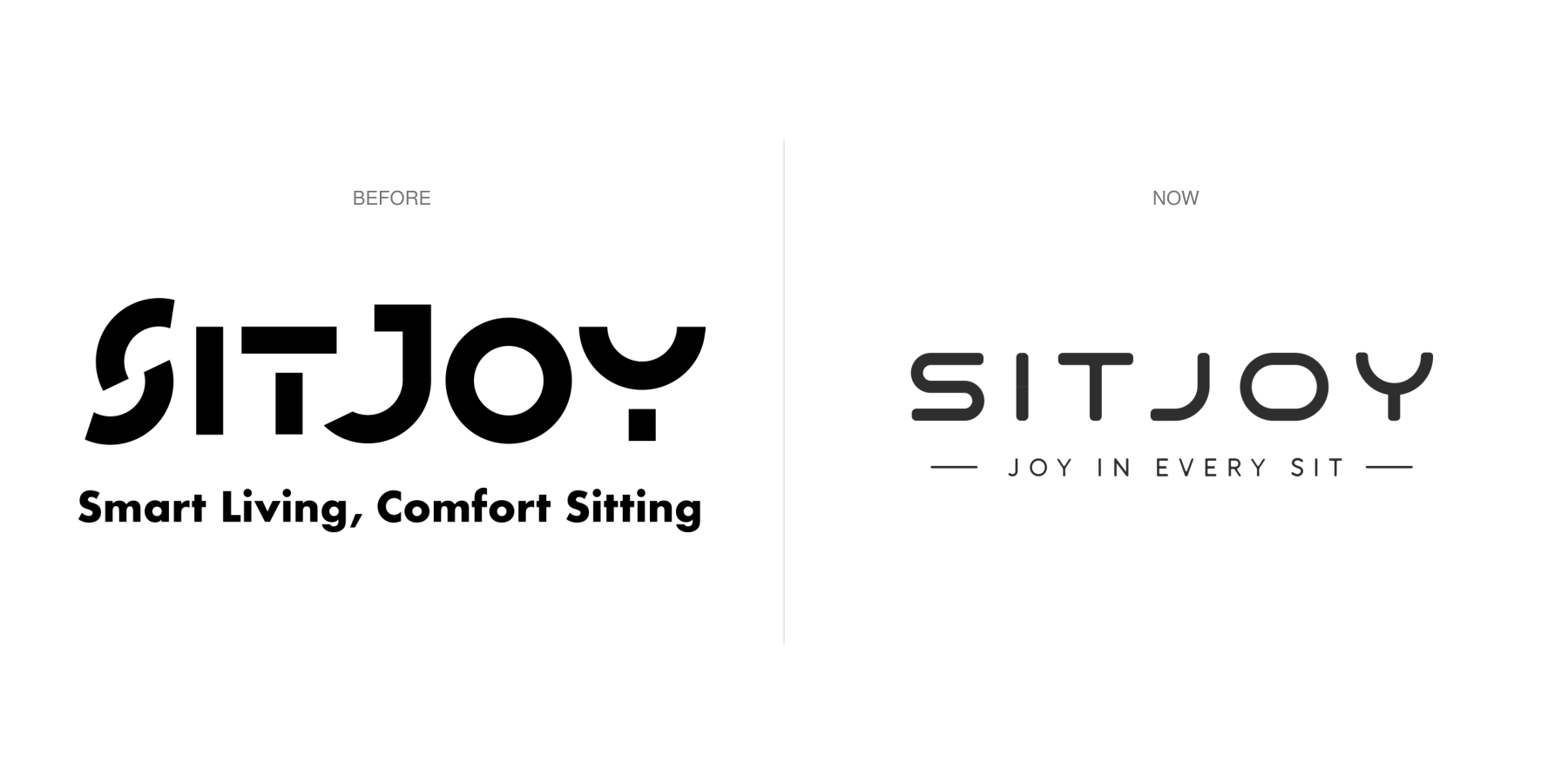
Left: old logo and slogan; Right: new logo and slogan.
The original logo presented the name "SITJOY" using bold geometric shapes and distinctive cutouts. The separated strokes created a unique visual rhythm, while the accompanying tagline—"Smart Living, Comfort Sitting"—conveyed a focus on lifestyle and a comfortable seating experience.
The new logo retains the geometric character of the lettering, including the arc above the "Y" that evokes a smile. Building on this foundation, the letterforms now feature more continuous outlines, with softened corners and stroke terminals.
The curves of the "S" flow smoothly, the "T" and "Y" form cohesive shapes, the "J" features a more relaxed arc, and the "O" presents a rounded, horizontally elongated profile. The letters share a more consistent linear rhythm, giving the name an approachable and relaxed feel.
These refinements ensure that the concept of "comfort" is visually expressed even before one reads the tagline.
Comfort can also begin with a curve.
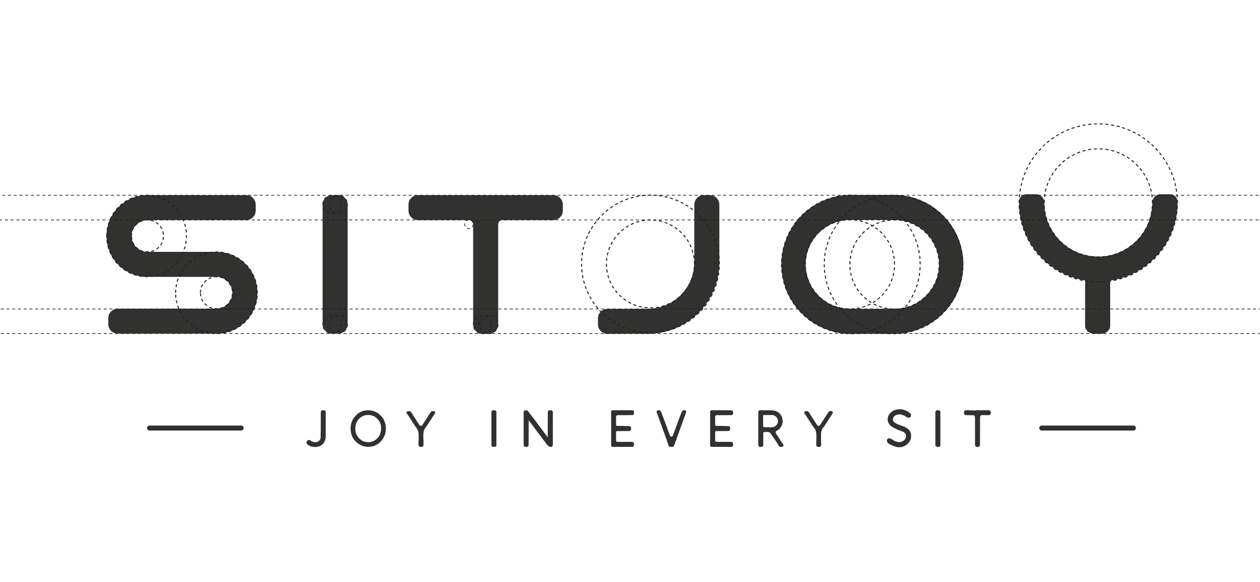
New Logo Linework Diagram: Illustrating the relationship between arcs, rounded corners, and the letterforms.
A close look at the new logo reveals that arcs and rounded corners are recurring motifs throughout the name.
The construction diagram illustrates the interplay between curves, strokes, and rounded corners: the turn of the "S," the base of the "J," the outline of the "O," and the upward-sweeping arc of the "Y" all echo one another across the characters.
Notably, the "Y" retains a distinctive visual signature: its upper section resembles a smiling mouth, creating a natural connection to the word "JOY." In this new version, the arc seamlessly joins the stroke below, integrating this familiar shape into the letterform itself.
The clean, dark lettering—paired with a light, airy tagline beneath—maintains a crisp silhouette while preserving a gentle aesthetic. From a distance, "SITJOY" is instantly recognizable; up close, the design offers intricate details that invite a closer look.
From settling in comfortably to savoring the moment.
With this update, our slogan has also evolved. "Smart Living, Comfort Sitting" focuses on lifestyle and the experience of sitting, while "JOY IN EVERY SIT" further conveys the feeling we hope comfort brings: the ability to enjoy a moment of your own every time you sit down.

Lifestyle concept image.
After a busy day, you can finally let your shoulders relax; open a book and slowly read a few pages; or sit with family and friends, letting the conversation flow naturally. Sitting down is a simple, everyday action, yet it often marks the beginning of these wonderful moments.
The name SITJOY brings together "SIT" and "JOY." Our new slogan makes this connection even more direct, grounding our message in the everyday experiences we all share. Comfort invites us to sit, while the moments of relaxation, companionship, and ease that follow give that act of sitting down deeper meaning.
The new look continues the focus on comfort.
In transitioning from the old logo to the new, we have preserved the sense of joy inherent in our name while giving it a softer, more complete expression. We hope that whenever you see SITJOY, you are reminded of a relaxing corner, a moment to savor, and the sense of ease that comes with sitting back and unwinding.
Thank you for connecting with SITJOY. We look forward to sharing life’s comfort and joy with you in this new look.